Conventions of a Film website
- Used to draw attention for a wider audience
- The design and features should draw the audience in, be interactive, give the audience a reason to return and tell others why it is significant they come
- Background may be the movie poster
- Reflects movie genre
- Trailer on the first home page
- Other tabs include: Tickets, Cast Profile, Photos, Behind the Scenes, etc
The following posting is very informative and even more detailed about the different conventions of a film website. I highly recommend checking it out if you want to make a film website for one of your productions, or if you are just a curious person. I’m just going to discuss features mentioned that stood out to me, and I might include them in my website.
- I love the idea of the “Behind the Scenes” tab. I for sure want to incorporate bloopers because I love seeing the cast interact with each other and jump from their character to their real selves. They are highly entertaining and something I always look for after viewing movies and television shows. I always want to show the bloopers of my projects in class, but it takes down the professionalism a notch so I usually refrain. This “Behind the Scenes” tab allows me to do whatever the heck I want because it is for the audience’s entertainment.
Merch
Merchandise is something I am going to look into in creating as well. In other research projects for this class, one thing I have learned is that the viewer’s are walking advertisements. Providing them with cool gear may spark questions from their friends which will get them to check it out themselves. Marketing is a pretty manipulative process but hey you gotta do what you gotta do, am I right? I will be going over my strategies in another post, so stay tuned
- Ticketing is another feature I will not ignore. I will insert a tab that automatically searches for where and when my film will be shown. It will also provide them with ways they can access it online if I choose to go that route (again, another marketing component for another time).
Social Media
This is going to be huge in my campaign because, especially considering my target audience, it is so so important and it is where Gen Z and Millennials go for information. This tab will link all the social media accounts so the audience can follow along and keep up with the movie.
Now I want to talk about a few sample websites that I found
Short Term 12

 This movie’s website has some features I really liked, and some I didn’t like. For example, it has a great marketing technique, which is something I had planned to do similarly, in which they have people submit their idea of home. This allows for a creative, fun, and interactive experience that also
promotes the film at the same time. They can submit a drawing, poem, photograph, etc. I really love this idea and also want to create this kind of social media campaign. I might include a scholarship chance too (Again marketing post will be soon!).
What I didn’t like about the website was it became super glitchy. I do not know if this is my computer, but a bunch of text is layered on top of each other making it hard to see. Also it is only one page where you have to scroll down to then click on future tabs. While you are scrolling little square boxes follow you (I think it is a link to their Instagram) which could be a strategy to get you to click on it, but I just thought it was annoying. I personally also prefer tabs/a toolbar at the top because it makes everything cleaner and easier to navigate.
The Impossible
The Impossible is a website I chose because it is based on a true story and I want my film to be realistic as well so I thought maybe I could draw inspiration from it.When you first type in the website, it takes you to this page pictured above. There is options on how to buy it/stream the movie which is a clear marketing strategy. It is easy and cuts right to the chase for those who are just looking for a way to access the movie.

As you click to enter the entire site,
this films trailer immediately opens up
and begins  playing. This is smart because it forces the audience to watch it. The trailer is captivating as well so it holds their attention. The site offers a gallery of images that automatically plays through a slideshow. There are tabs like videos, reviews, awards, soundtracks, and finally the really cool “true story” tab. I like how they included the real story on their website because it allows for some context and you can see what specific elements from the movie actually happened in real life.
Room
playing. This is smart because it forces the audience to watch it. The trailer is captivating as well so it holds their attention. The site offers a gallery of images that automatically plays through a slideshow. There are tabs like videos, reviews, awards, soundtracks, and finally the really cool “true story” tab. I like how they included the real story on their website because it allows for some context and you can see what specific elements from the movie actually happened in real life. Room
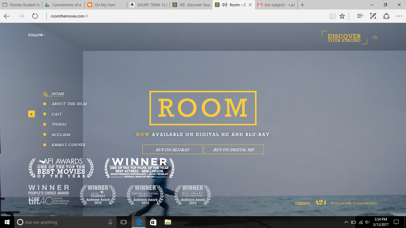
 This site also opens to DVD/download options like “The Impossible” did. As I already noted this I want to talk about how the home page of the whole site has a GIF of Jack running ahead of Ma in the background. This is just a very cute personal touch that I loved. Also there is an audio on loop of Ma singing the song she sang to Jack to add to a more immersive experience for the site viewers. I really like the bright yellows and blue combinations scattered throughout the text. They also advertised a great marketing campaign about how “No one has to be strong alone” because Jack always talked about how his strong was his hair. If you click on that part of the site it takes you to a page like the one on the right. A video eventually opens up about Bri Larson speaking on this topic and I just really like how they got the cast involved.
***Just a quick idea I want to note for my website, I was thinking of having a page where I ask people their story. There they can share either a positive or negative experience they had with the foster care system. I think this will show the good and the bad that can come out of being in this system and will work to create awareness.
That’s all for today!
Until next time,
-C
No comments:
Post a Comment