Long time no talk! I am so excited to start blogging again with our new upcoming projects for the A level of AICE Media Studies. For the next several weeks, I will be working on the production of two trailers, a website, and a movie poster for a brand new film. Woohooo! To begin with, you might have noticed how the background of my blog is no longer clouds and blue skies. I have replaced it with darker tones and city light to go with the mood of my film. The look I am going for is very different from my magazine which is really positive and happy. My film is about the foster care program, which is a place filled with distraught kids who want to be wanted. I originally got this idea when I began reflecting on the types of movies I like to watch. I tend to gravitate toward Chick flicks but also have been interested in psychological movies, kidkappings, and ones about struggling teens.
Some further insight: a couple of years ago,I went on a trip to Haiti where I volunteered at an orphanage. Seeing those kids and being able to interact with them made me realize how much I wanted to do something like this is in my life. I will be majoring in Family and Children Sciences at my college and hopefully will go in the direction of Social Working or just helping the victims of kids taken away from their families. One thing I learned about this is that in the past, once a child turned 18 and they are not adopted, they basically get kicked out of the system. This to me is unreal because now they are by themselves on the streets with nobody. I have tried to find movies about the foster care system, and there are not very many. One movie that closely resembles what I had in mind is Short Term 12. This movie features Bri Larson from the popular movie Room. In Short Term 12, she plays “A 20-something supervising staff member of a residential treatment facility navigates the troubled waters of that world alongside her co-worker and longtime boyfriend.” She develops these close relations with these kids and they look up to her for care, advice, and support. While my film is not focused on a group home, the characteristics these kids embrace are ones I might pull influence from for my character.
I have researched the facts about what happens to kids who age out of the system and this is what I have found.
This old article shows that the foster care system in New York is supposed to provide training for apartment hunting, finances, etc. but many don’t. Also there are some shelters available but the kids end up in in unfitted environments such as vacant buildings, public terminals, and the city’s streets. The shelters are overcrowded as well.
In this article, they mention that some kids end up “more likely to drop out of school, become parents before they are ready, experience homelessness, fall victim to human trafficking, be unemployed or be incarcerated – costly consequences that affect us all.” These are effects I will consider incorporating as a possible plot detail especially the homeless part. Later the article tells us that most states have extended the age from 18 to 21 thankfully , so to create an accurate film, my time period will have to be a couple years back. Sometimes there are certain standards the children have to reach in order to receive extensive care after 18. However, those who choose to leave because they believe they can, are not able to support themselves and end up homeless. So this is something I will be keeping in mind and will have to further research. As of now, my film will probably take place in around 2009, where the legislation that provided extended care was not passed or not really enforced yet.
Be sure to check back weekly for updates on my progress!
Until next time,
-Carli
Thursday, March 2, 2017
Sunday, April 10, 2016
Critical reflection!!
Works cited:
"Eating Disorders | Adventures of the Incredible Shrinking Girl." Adventures of the Incredible Shrinking Girl. N.p., n.d. Web. 10 Apr. 2016.
"Britney Spears News." Exhale. N.p., 21 Mar. 2013. Web. 24 Mar. 2016.


Thursday, April 7, 2016
Operation Cover Page Completed
After hearing multiple opinions, I have decided to stick with Word and that is final! A few people told me not to use it because they thought I would not be able to do more artsy things with my magazine. On the other hand, my friend Camila told me that the majority of her class used either Word or Power point and they came out really nice. I just do not have the time to learn a new software. Anyways, like I said before, Word is much easier for me to use and I am much more familiar with it. So, now that we have that settled, I also realized something that I was missing...COLORS!! I only had one set color to use for my magazine,which was magenta. Therefore I had a lot of white space. I googled color combinations for magenta and these are some that I liked:
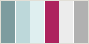
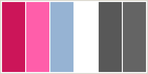
I really loved the light blue and the magenta together, but before I committed to it, I took the time to research the color blue and what it represents. Turns out, blue also fits my magazine because it represents inner security and confidence, a feeling that I want my readers to be able to have.
Once again, I have spent another day working for 4 plus hours, but this time I actually made progress and... wait for it...finished my Cover Page!! I mean, I had all the information and pictures before, but now I finally put it all together. In order to build up the suspense for the big reveal on Sunday, I will just show you the mast head of my cover page (which I am quite proud of)

Don't be alarmed, I covered the rest of the page with a temporary white box, so yes, I do have more than just a title. I also want to point out that since my title is called Inside Out, it is inside and outside the blue lines too (see what I did there?)!
That's all I have for today, you can expect an update on the TOC tomorrow!
-C
Works Cited:
Magenta Color Schemes- Magenta Color Palette." Color Combos. N.p., n.d. Web. 7 Apr. 2016.
The Color Blue." Empowered By Color. N.p., n.d. Web. 07 Apr. 2016.
Wednesday, April 6, 2016
STRESS
For this blog post I just need to vent about my current emotions!!!
A new wave of stress has washed over me. As I have been in my room for the past four hours, I am not liking how everything is turning out. The image that I originally had for my TOC did not turn out the way I wanted it too. I am currently trying to move things around, adjust font combinations, rearrange pictures, etc. I may be even switching softwares...again (oy vey). I know as soon as I can settle on a software that I like I can go from there and hopefully things will move faster. I have all the content, I just can't put it all together. I am probably going to leave school early to work on this because I want to turn in something that I am proud of. I want all this work to pay off and Sunday is right around the corner (which is terrifying). Sorry for the short post, but I must get back to work.
Wish me luck!
-C
Tuesday, April 5, 2016
Slow but Sure
AHHHHHHHH
Okay so I know I said I would have the TOC and Cover page done by Sunday (fail), but I have been really busy with makeup work and have not had time to properly complete them. I continued working on the cover page immediately after I got back from camping, but I did not expect the amount of time it took to eliminate the background of this picture.

It is a lot more time consuming then it looks. I started to use a program my Mom has on her computer but found that using Power point was easier to figure out. There was an eliminate background option and you had to carefully outline each of their figures in order to take out the rest of the background. Anyway, I ended up with this, which is not bad considering how technologically challenged I am with this stuff.

Then, all day today I have been jumping between different softwares in order to create my magazine. It is much harder than it seems because if you change programs, then you have to learn how to use the other program. I couldn't figure Joomag out and started to get impatient, so I switched to Canva. Unfortunately, Canva only allows you to use their fonts, so If I continued with that software, then I wouldn't have been able to keep my mast head font that I loved. I then decided to download photo shop (which took forever). And just my luck, photo shop had certain aspects that were difficult for me to use, such as clicking and moving a text box (trust me it was not as simple as it sounds). Finally, I ended up falling back into my comfort zone and using Word (so much easier).
I also captured my final pictures of the food that I need for my TOC


Who knew taking a good picture of bananas would be that difficult (it probably took me over 20 minutes)? I know you're probably dying to see what my TOC and Cover Page look like, but I am going to wait until this weekend to reveal the final product. Don't worry though I will still show you bits and pieces of it in the next few blog posts.
Stay tuned!
-C
Friday, April 1, 2016
The Reasoning Behind the Photos
After taking 100 photos, I now have to decide which ones I like the best. I must ask myself things like, does it look better vertical or horizontal, mid shot or full body shot? As I went through each photo and began to eliminate 90% of them, I realized the only picture I actually explained in previous blog posts was the cover image. So, I want to address my vision for the TOC and for the two page spread. First here is a sketch that I quickly drew so you guys can understand how I want my pictures to look in the TOC:
 Please excuse the awful drawings, the point was just to get an idea of the layout across. Each image represents a cover line that was on the cover page. Most of the pictures are going to be close ups. As you can see, there is a mix of vertical photos (inspiration from the TOC example that I showed a couple of posts ago) and a horizontal photo. The horizontal picture is of the eyes of Camila and Emily and represents my two page spread article. One reason why the picture is horizontal and not vertical like the rest
of the images is because this is the cover story and I want it to be
highlighted/easily noticeable in the TOC. In the actual article, I will be using the pictures of Camila and Emily each writing positive words about themselves in the mirror that outline their reflection. I will talk more about why these photos are significant for the article later. The first vertical picture (I have not taken yet) is going to be of a smoothie and goes with the cover line 10 Simple and Healthy Recipes Using Ingredients You Probably Already Own. The second picture is the one I took of the close up on Camila's feet in the air as she jumps on the trampoline. This photos represents the cover line Fun Activities That are Surprisingly Great Exercise. The third photo is of a hamburger (I tried) but I will probably change it to a healthier food that is high in carbohydrates. This photo matches with the Myth Busters: Carbs are Not the Enemy cover line. Finally, the last one is the close up of Emily planking ( I actually love how that picture came out) and goes with the cover line Amazing At Home Workouts. I plan to have these pictures by the Features section of the TOC and then include other articles and their matching pages below that section.
Please excuse the awful drawings, the point was just to get an idea of the layout across. Each image represents a cover line that was on the cover page. Most of the pictures are going to be close ups. As you can see, there is a mix of vertical photos (inspiration from the TOC example that I showed a couple of posts ago) and a horizontal photo. The horizontal picture is of the eyes of Camila and Emily and represents my two page spread article. One reason why the picture is horizontal and not vertical like the rest
of the images is because this is the cover story and I want it to be
highlighted/easily noticeable in the TOC. In the actual article, I will be using the pictures of Camila and Emily each writing positive words about themselves in the mirror that outline their reflection. I will talk more about why these photos are significant for the article later. The first vertical picture (I have not taken yet) is going to be of a smoothie and goes with the cover line 10 Simple and Healthy Recipes Using Ingredients You Probably Already Own. The second picture is the one I took of the close up on Camila's feet in the air as she jumps on the trampoline. This photos represents the cover line Fun Activities That are Surprisingly Great Exercise. The third photo is of a hamburger (I tried) but I will probably change it to a healthier food that is high in carbohydrates. This photo matches with the Myth Busters: Carbs are Not the Enemy cover line. Finally, the last one is the close up of Emily planking ( I actually love how that picture came out) and goes with the cover line Amazing At Home Workouts. I plan to have these pictures by the Features section of the TOC and then include other articles and their matching pages below that section.
This weekend, I am going camping, but I am still committed to finishing my TOC and Cover page by Sunday. I just felt like I needed to explain the pictures that I took yesterday.
See you Sunday!
-C

This weekend, I am going camping, but I am still committed to finishing my TOC and Cover page by Sunday. I just felt like I needed to explain the pictures that I took yesterday.
See you Sunday!
-C
Subscribe to:
Posts (Atom)